Discipline
Branding
Veridex
Veridex Consulting helps businesses make better decisions through strategic financial, operational, and technological advisory. With a focus on truth, precision, and measurable results, the brand...
Veridex
Fintech company
Veridex Consulting helps businesses make better decisions through strategic financial, operational, and technological advisory. With a focus on truth, precision, and measurable results, the brand needed an identity that communicated what it stands for: helping businesses move forward with clarity and confidence.
The Challenge
Veridex works across different areas of consulting, each with its own focus and expertise. The challenge was to bring everything together under one identity without making the brand feel scattered or complicated. It also needed to stand out in an industry where many consulting firms look and feel alike.
The Thinking
We wanted the identity to reflect how Veridex works: bringing different perspectives together, finding clarity in complex information, and helping businesses make informed decisions. Rather than relying on the usual corporate look, we explored geometric forms and a more expressive colour palette to create something structured, professional, and distinctive.
The Solution
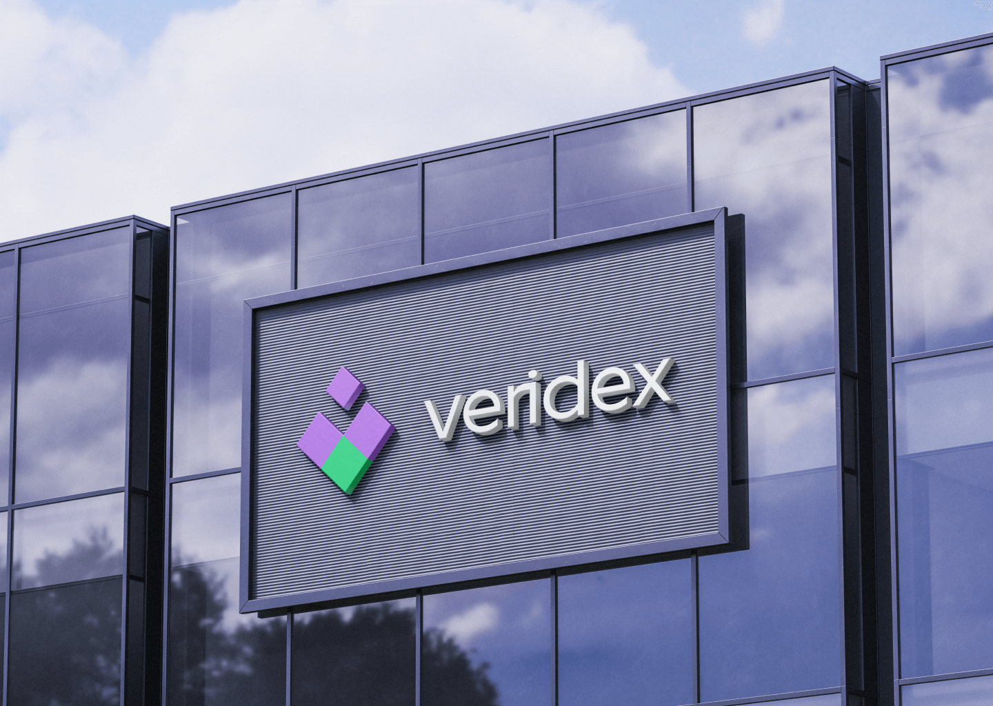
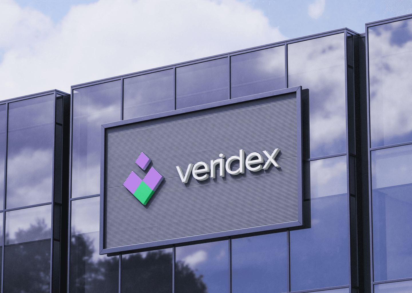
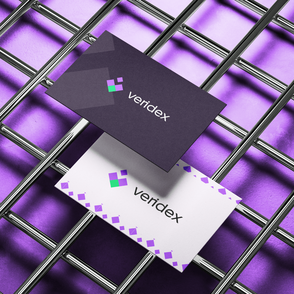
We built the identity around a geometric symbol made up of individual shapes that come together to form one cohesive mark. It represents the different areas of expertise that work together to help businesses succeed.
The Outcome
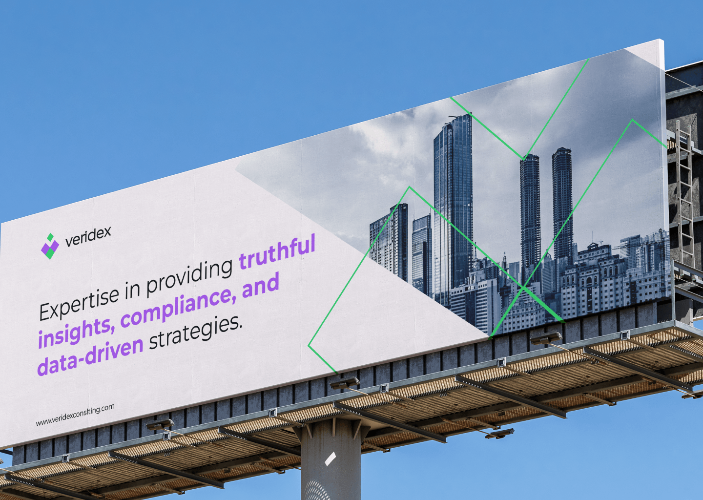
The result is an identity that brings Veridex's different services together without losing what makes the brand distinctive. It balances the trust expected of a consulting firm with a fresh, confident visual presence, giving the business a consistent way to communicate its values across different touchpoints.
What I Learned
Sometimes, the challenge isn't showing everything a business does; it's finding what connects it all. With Veridex, that connection was precision, clarity, and the belief that better decisions start with better insights. That became the foundation for an identity that feels like one brand, not several services competing for attention.